|
|
Hamakor's LogoMy butterfly design |
In April 2003, Hamakor, the newly created Israeli Society for Free Software and Open Source, was looking for a new logo. A public contest was announced. People were asked to design a logo that:
The challenge interested me. It actually involved two challenges, like any art work. One challenge was coming up with an idea. A logo that is not only aesthetically pleasing, but also says something. The other challenge was the actual execution - actually drawing or rendering the logo. I was more confident of my skills in the first aspect than in the second, but I decided to try anyway.
My first submission, which you can also see on the right of this paragraph, was a logo that included the name of the association (i.e., it was not a mascot). The name was written in a unique font, with an especially unique letter mem whose head was replaced by a head of a bird (a pun on the fact that in modern Hebrew the words for "source" and "beak" sound the same). I liked this design, but not enough. I thought I could do better, and indeed I could. Soon I designed a second logo, one that was going to win the competition, and become Hamakor's logo and the topic of this page. The butterfly logo.
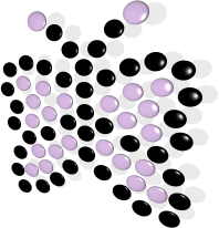
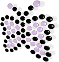
My second submission was the butterfly mascot which you can see on the right, and with greater resolution below. The concept was simple graphically, made of circles of two colors (that can be even reduced to one color). But by making it look 3D, it got a more "sophisticated" and aesthetically-pleasing look.
But this logo was not just nice-looking, it was also packed with meaning and symbolism. In the description that accompanied by competition entry, I explained that
The distinctive butterfly logo gives the feeling of freedom, flight ("ma`of"), beauty - everything that reminds us of free software. The butterfly itself is composed of many bright "pebbles", symbolising the fact that the world of free software is made up from a bunch of bright individuals acting together to form a beautiful whole.
The choice of colors gives a feeling of youth, in addition to being a distinctive pair of colors that can be used in other places to symbolize our association. I belive the choice of the oblique camera angle, generating an assymetric look to the basically-symmetric butterfly shape, also gives a feeling of freshness.

My butterfly logo was one of the 8 logos submitted to the competition by 6 people. The Amuta's members (less than 50 at the time) were elligable to vote, and apparently they liked my butterfly. It won by a large margin - 27 people voted for it, with the next runner up getting only 9 votes.
One of the requirements of the competition was that the logo should be scalable, i.e., could be re-rendered at any chosen resolution. Because I was trying to produce a 3D-looking logo, I decided to use POV-Ray (Persistence of Vision), an excellent free ray tracer.
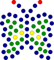
But I started by designing the 2D layout of the butterfly and its pebbles. I did it with Xfig, one of the oldest free drawing programs that is still quite useful today. The result was butterfly.fig, which looked something like the picture to the right of this paragraph. In this figure, the pebble's positions are important, and their radius is arbitrary. The colors of the pebbles are "false colors", i.e., were used as a differentiator between the various pebble areas (those on the boundary of the picture, those on the antennae, etc.).
This figure, in Xfig format, had to be translated into a format that POV-Ray can understand. I wrote a simple AWK script, butterfly.genpov, to do it. This script that takes butterfly.fig, and converts the circles in the various positions into a list of Povray objects (based on objects defined in the pov source file, see below). The color of each circle in butterfly.fig determines which object will be used - BP, bigBP, or xBP (these will correspond to small black pebbles, small purple pebbles and large purple pebbles).
Now finally, I was able to create butterfly3.pov, the POV-Ray source file for generating the final logo I sent to the competition. This file contains a preamble defining the camera angle, the back wall and ambiance, and what a "Pebble" object is. It then defines 3 special kinds of pebbles (with different sizes and colors) BP, bigBP and xBP, and then comes the output of the butterfly.genpov script, placing the different kinds of pebble objects in the appropriate coordinates. I experimented with many of these parameters - the angle, wall placement and properties (controlling the depth and color of the shadows), materials and colors, until I got the final version I was pleased with.
This butterfly3.pov can now be rendered at arbitrary resolution using the POV-Ray software. For example, to generate the small png logo I sent as my main suggestion for the logo (that you can see on the right), I did the following: (note that different version of povray might have slightly different usage - I was using a relatively old version, 3.1g, and its output was by default in the "tga" format).
If you wish, you can remove the excess white space around the picture with pnmcrop, likepovray +Ibutterfly3.pov slow.ini res640.ini tgatoppm butterfly3.tga | pnmscale 0.3 | pnmtopng > butterfly.png
And so on.tgatoppm butterfly3.tga |pnmscale 0.3 | pnmcrop | pnmtopng >butterfly.png